Свойство CSS width
Свойство CSS width задаёт ширину элемента. Ширина не включает border, padding или margin. Обратите внимание, что это относится к модели блока по умолчанию content-box; при box-sizing: border-box padding и border включаются в расчёт ширины.
Свойство width применяется ко всем элементам, кроме строчных элементов без замены, строк таблицы и групп строк (то есть <thead>, <tfoot> и <tbody>).
Свойство принимает длину CSS (px, pt, em и т. д.), процент или ключевое слово auto.
Обратите внимание, что значение в процентах основано на ширине родительского элемента (содержащего блока). Для абсолютно позиционированных элементов процент вычисляется относительно ширины padding box содержащего блока.
Свойство width может быть переопределено свойствами min-width и max-width.
INFO
Отрицательные значения длины недопустимы.
| Initial Value | auto |
|---|---|
| Applies to | All elements except non-replaced inline elements, table rows, and row groups. |
| Inherited | No. |
| Animatable | Yes. The width of an element is animatable. |
| Version | CSS1 |
| DOM Syntax | Object.style.width = "300px"; |
Синтаксис
Синтаксис свойства CSS width
width: auto | length | percentage | initial | inherit | fit-content | min-content | max-content | stretch;Пример свойства width, заданного в “%”:
Пример свойства CSS width со значением %
<!DOCTYPE html>
<html>
  <head>
    <title>Title of the document</title>
    <style>
      div {
        width: 50%;
        background-color: #1c87c9;
      }
    </style>
  </head>
  <body>
    <h2>Width property example</h2>
    <div>
      Lorem Ipsum is simply dummy text of the printing and typesetting industry. Lorem Ipsum has been the industry's standard dummy text ever since the 1500s, when an unknown printer took a galley of type and scrambled it to make a type specimen book.
    </div>
  </body>
</html>Результат
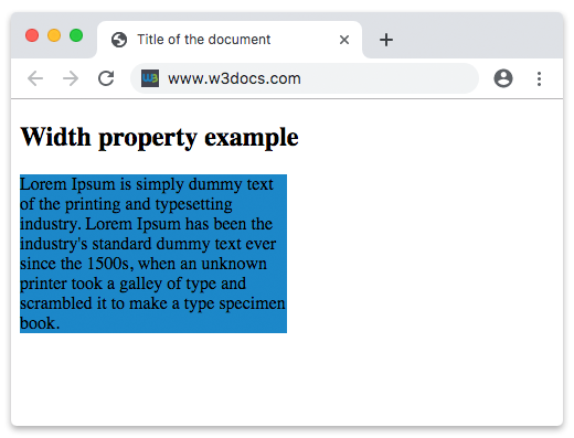
В приведённом примере ширина контейнера div составляет 50%.
В следующем примере ширина первого элемента составляет 250px, а второго — 25em:
Пример свойства width, заданного в “px” и “em”:
Пример свойства CSS width со значениями px и em
<!DOCTYPE html>
<html>
  <head>
    <title>Title of the document</title>
    <style>
      div.t1 {
        width: 250px;
        border: 1px solid black;
        background-color: #1c87c9;
      }
      div.t2 {
        width: 25em;
        border: 1px solid black;
        background-color: #8ebf42;
      }
    </style>
  </head>
  <body>
    <h2>Width property example</h2>
    <h3>width: 250px</h3>
    <div class="t1">
      Lorem Ipsum is dummy text of the printing and typesetting industry. Lorem Ipsum has been the industry's standard dummy text ever since the 1500s when an unknown printer took a galley of type and scrambled it to make a type specimen book. It has survived not only five centuries, but also the leap into electronic typesetting, remaining essentially unchanged. It was popularised in the 1960s with the release of Letraset sheets containing Lorem Ipsum passages, and more recently with desktop publishing software like Aldus PageMaker including versions of Lorem Ipsum.
    </div>
    <h3>width: 25em</h3>
    <div class="t2">
      Lorem Ipsum is simply dummy text of the printing and typesetting industry. Lorem Ipsum has been the industry's standard dummy text ever since the 1500s when an unknown printer took a galley of type and scrambled it to make a type specimen book. It has survived not only five centuries, but also the leap into electronic typesetting, remaining essentially unchanged. It was popularised in the 1960s with the release of Letraset sheets containing Lorem Ipsum passages, and more recently with desktop publishing software like Aldus PageMaker including versions of Lorem Ipsum.
    </div>
  </body>
</html>Значения
| Value | Description | Play it |
|---|---|---|
| auto | Браузер вычислит ширину для указанного элемента. Это значение по умолчанию. | Play it » |
| length | Определяет ширину в px, pt, cm и т. д. | Play it » |
| percentage | Определяет ширину в процентах от содержащего элемента. | Play it » |
| initial | Заставляет свойство использовать значение по умолчанию. | Play it » |
| inherit | Наследует свойство от родительского элемента. | |
| fit-content | Вычисляет ширину на основе внутреннего размера содержимого. | Play it » |
| min-content | Вычисляет ширину на основе минимального размера содержимого. | Play it » |
| max-content | Вычисляет ширину на основе максимального размера содержимого. | Play it » |
| stretch | Растягивает элемент, чтобы заполнить контейнер. | Play it » |
Практика
Какова функция свойства 'width' в CSS?