Свойство CSS transform
Свойство CSS transform применяет к элементу двумерное или трёхмерное преобразование. Это одно из свойств CSS3. Это свойство позволяет поворачивать, наклонять, масштабировать или перемещать элемент. Оно принимает значение none или одну из функций преобразования.
INFO
Преобразования можно применять к любому элементу, включая блочные, flex-, grid- и строчные элементы.
| Initial Value | none |
|---|---|
| Applies to | Transformable elements. |
| Inherited | No. |
| Animatable | Yes. |
| Version | CSS3 |
| DOM Syntax | Object.style.transform = "rotate(10deg)"; |
Синтаксис
Значения CSS transform
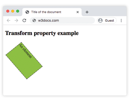
transform: none | transform-functions | initial | inherit;Пример свойства transform:
Пример кода CSS transform
<!DOCTYPE html>
<html>
  <head>
    <title>Title of the document</title>
    <style>
      div {
        border: 2px dashed #666;
        background-color: #8ebf42;
        transform: translate(10px, 40px) rotate(50deg);
        width: 130px;
        height: 80px;
      }
    </style>
  </head>
  <body>
    <h2>Пример свойства transform</h2>
    <div>An element</div>
  </body>
</html>Результат
Пример свойства transform со значениями "rotate", "skewY", "scaleY", "translateX", "skew":
Пример нескольких значений CSS transform
<!DOCTYPE html>
<html>
  <head>
    <title>Title of the document</title>
    <style>
      div {
        margin: 35px 20px;
      }
      div.box1 {
        width: 130px;
        height: 80px;
        border: 1px solid #000;
        background-color: #1c87c9;
        transform: rotate(30deg);
      }
      div.box2 {
        width: 120px;
        height: 80px;
        border: 1px solid #000;
        background-color: #8ebf42;
        transform: skewY(30deg);
      }
      div.box3 {
        width: 160px;
        height: 80px;
        border: 1px solid #000;
        background-color: #FFFF00;
        transform: scaleY(1.5);
      }
      div.box4 {
        width: 160px;
        height: 80px;
        border: 1px solid #000;
        background-color: #ccc;
        transform: rotate(160deg);
      }
      div.box5 {
        width: 160px;
        height: 80px;
        border: 1px solid #000;
        background-color: #990099;
        transform: translateX(50px);
      }
      div.box6 {
        width: 160px;
        height: 80px;
        border: 1px solid #000;
        background-color: #FF0000;
        transform: skew(170deg, 170deg);
      }
    </style>
  </head>
  <body>
    <h2>Пример свойства transform</h2>
    <h3>transform: rotate(30deg):</h3>
    <div class="box1"></div>
    <h3>transform: skewY(30deg):</h3>
    <div class="box2"></div>
    <h3>transform: scaleY(1.5):</h3>
    <div class="box3"></div>
    <h3>transform: rotate(160deg):</h3>
    <div class="box4"></div>
    <h3>transform: translateX(50px):</h3>
    <div class="box5"></div>
    <h3>transform: skew(170deg,170deg):</h3>
    <div class="box6"></div>
  </body>
</html>Значение "skew"
Значение преобразования skew() используется для наклона элемента по оси x и оси y. Значения преобразования skewX() и skewY() используются для наклона элемента по оси x или по оси y.
Значение "rotate"
С помощью значения rotate() элемент поворачивается по часовой стрелке из исходного положения. Использование отрицательного значения поворачивает его в противоположном направлении.
Значение "translate"
Значение translate() перемещает элемент вверх или вниз, а также в стороны. Ниже представлены дополнительные значения.
Значения
| Value | Description | Play it |
|---|---|---|
| none | No transform is applied. | Play it » |
| translate() | Translates the element by a vector [tx, ty]. Tx is the translation along the x-axis. Ty is the translation along the y-axis. | Play it » |
| translateX() | Translates the element along the x-axis. | Play it » |
| translateY() | Translates the element along the y-axis. | Play it » |
| scale(x, y) | Scales an element up or down. | Play it » |
| scaleX() | Scales an element along the x-axis. | Play it » |
| scaleY() | Scales an element along the y-axis. | Play it » |
| rotate(angle) | Rotates an element in two-dimensional space. The angle is specified in the parameter. | Play it » |
| skew() | Defines a 2D skew transformation along the x-axis and the y-axis. | Play it » |
| skewX() | Defines a 2D skew transformation along the x-axis. | Play it » |
| skewY() | Defines a 2D skew transformation along the y-axis. | Play it » |
| matrix() | Defines a 2D transformation, using a matrix of six values. | Play it » |
| translateZ() | Translates an element by the given amount along the z-axis. | |
| translate3d() | Defines a three dimensional translation. | |
| scaleZ() | Scales an element in the third dimension, along the z-axis. | |
| scale3d() | Defines a three dimensional scale transformation. | |
| rotateX() | Rotates an element about the x-axis in three-dimensional space. | Play it » |
| rotateY() | Rotates an element about the y-axis in three-dimensional space. | Play it » |
| rotateZ() | Rotates an element about the z-axis in three-dimensional space. | Play it » |
| rotate3d() | Defines a three dimensional rotate transformation. | |
| matrix3d() | Defines a 3D transformation, using a 4x4 matrix of 16 values. | |
| perspective() | Defines a perspective view for the three dimensional element. | |
| initial | Makes the property use its default value. | |
| inherit | Inherits the property from its parent element. |
Практика
Which statement is incorrect about transform properrty?