Свойство CSS grid-auto-flow
Свойство grid-auto-flow управляет тем, как автоматически размещаемые элементы располагаются в сетке.
Это свойство имеет следующие значения: row, column, dense, row-dense, column-dense. Если не указано ни "row", ни "column", по умолчанию подразумевается "row".
Свойство grid-auto-flow может принимать либо одно ключевое слово (dense, column или row), либо два ключевых слова (column-dense или row-dense).
| Начальное значение | row |
|---|---|
| Применяется к | Контейнеры сетки. |
| Наследуется | Нет. |
| Анимируется | Нет. |
| Версия | CSS Grid Layout Module Level 1 |
| Синтаксис DOM | object.style.gridAutoFlow = "row"; |
Синтаксис
Синтаксис свойства CSS grid-auto-flow
css
grid-auto-flow: row | column | dense | row-dense | column-dense | initial | inherit;Пример: grid-auto-flow: column
html
<!DOCTYPE html>
<html>
  <head>
    <title>Title of the document</title>
    <style>
      .grey-container {
        display: grid;
        grid-template-columns: auto auto auto;
        grid-template-rows: auto auto;
        grid-auto-flow: column;
        gap: 10px;
        background-color: #ccc;
        padding: 10px;
      }
      .grey-container > div {
        background-color: #eee;
        text-align: center;
        padding: 20px 0;
        font-size: 30px;
      }
    </style>
  </head>
  <body>
    <h2>Grid-auto-flow property example</h2>
    <h3>grid-auto-flow: column</h3>
    <div class="grey-container">
      <div>1</div>
      <div>2</div>
      <div>3</div>
      <div>4</div>
    </div>
  </body>
</html>Здесь элементы размещаются путем заполнения каждой колонки. В следующем примере видно, что элементы размещаются путем заполнения каждой строки.
Пример: grid-auto-flow: row
html
<!DOCTYPE html>
<html>
  <head>
    <title>Title of the document</title>
    <style>
      .white-container {
        display: grid;
        grid-template-columns: auto auto auto;
        grid-template-rows: auto auto;
        grid-auto-flow: row;
        gap: 10px;
        background-color: #ccc;
        padding: 10px;
      }
      .white-container > div {
        background-color: #fff;
        text-align: center;
        padding: 20px 0;
        font-size: 30px;
      }
    </style>
  </head>
  <body>
    <h2>Grid-auto-flow property example</h2>
    <h3>grid-auto-flow: row</h3>
    <div class="white-container">
      <div>1</div>
      <div>2</div>
      <div>3</div>
      <div>4</div>
    </div>
  </body>
</html>Пример: grid-auto-flow: row (с явным размещением)
html
<!DOCTYPE html>
<html>
  <head>
    <title>Title of the document</title>
    <style>
      .grey-container {
        height: 250px;
        width: 250px;
        display: grid;
        gap: 20px;
        grid-template: repeat(4, 1fr) / repeat(2, 1fr);
        grid-auto-flow: row;
        background-color: #ccc;
        padding: 10px;
      }
      .box1 {
        background-color: #00f3ff;
        grid-row-start: 3;
      }
      .box2 {
        background-color: #ff00d4;
      }
      .box3 {
        background-color: #827c7c;
      }
      .box4 {
        grid-column-start: 2;
        background-color: orange;
      }
    </style>
  </head>
  <body>
    <div class="grey-container">
      <div class="box1"></div>
      <div class="box2"></div>
      <div class="box3"></div>
      <div class="box4"></div>
    </div>
  </body>
</html>Результат
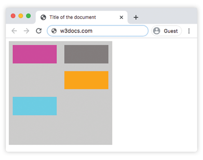
Пример: grid-auto-flow: column (с явным размещением)
html
<!DOCTYPE html>
<html>
  <head>
    <title>Title of the document</title>
    <style>
      .grey-container {
        height: 250px;
        width: 250px;
        display: grid;
        gap: 20px;
        grid-template: repeat(4, 1fr) / repeat(2, 1fr);
        grid-auto-flow: column;
        background-color: #ccc;
        padding: 10px;
      }
      .box1 {
        background-color: #00f3ff;
        grid-row-start: 3;
      }
      .box2 {
        background-color: #827c7c;
      }
      .box3 {
        background-color: #ff00d4;
      }
      .box4 {
        grid-column-start: 2;
        background-color: #4cbb13;
      }
    </style>
  </head>
  <body>
    <div class="grey-container">
      <div class="box1"></div>
      <div class="box2"></div>
      <div class="box3"></div>
      <div class="box4"></div>
    </div>
  </body>
</html>Пример: grid-auto-flow: column-dense
html
<!DOCTYPE html>
<html>
  <head>
    <title>Title of the document</title>
    <style>
      .grey-container {
        height: 250px;
        width: 250px;
        display: grid;
        gap: 20px;
        grid-template: repeat(4, 1fr) / repeat(2, 1fr);
        grid-auto-flow: column-dense;
        background-color: #ccc;
        padding: 10px;
      }
      .box1 {
        background-color: #0ad6e0;
        grid-row-start: 3;
      }
      .box2 {
        background-color: #841c72;
      }
      .box3 {
        background-color: #827c7c;
      }
      .box4 {
        grid-column-start: 2;
        background-color: #4cbb13;
      }
    </style>
  </head>
  <body>
    <div class="grey-container">
      <div class="box1"></div>
      <div class="box2"></div>
      <div class="box3"></div>
      <div class="box4"></div>
    </div>
  </body>
</html>Пример: grid-auto-flow: row-dense
html
<!DOCTYPE html>
<html>
  <head>
    <title>Title of the document</title>
    <style>
      .grey-container {
        height: 250px;
        width: 250px;
        display: grid;
        gap: 20px;
        grid-template: repeat(4, 1fr) / repeat(2, 1fr);
        grid-auto-flow: row-dense;
        background-color: #ccc;
        padding: 10px;
      }
      .box1 {
        background-color: #0ad6e0;
        grid-row-start: 3;
      }
      .box2 {
        background-color: #841c72;
      }
      .box3 {
        background-color: #827c7c;
      }
      .box4 {
        grid-column-start: 2;
        background-color: #4cbb13;
      }
    </style>
  </head>
  <body>
    <div class="grey-container">
      <div class="box1"></div>
      <div class="box2"></div>
      <div class="box3"></div>
      <div class="box4"></div>
    </div>
  </body>
</html>Значения
| Значение | Описание | Запустить |
|---|---|---|
| row | Размещает элементы путем заполнения каждой строки, добавляя новые строки при необходимости. Это значение по умолчанию для данного свойства. | Запустить » |
| column | Размещает элементы путем заполнения каждой колонки, добавляя новые колонки при необходимости. | Запустить » |
| dense | Размещает элементы, заполняя любые пустые места в сетке, независимо от размера элементов. Это может привести к тому, что автоматически размещаемые элементы будут отображаться не в порядке DOM. | Запустить » |
| row-dense | Размещает элементы путем заполнения каждой строки и заполняет пустые места в сетке. | Запустить » |
| column-dense | Размещает элементы путем заполнения каждой колонки и заполняет пустые места в сетке. | Запустить » |
| initial | Заставляет свойство использовать значение по умолчанию. | |
| inherit | Наследует свойство от родительского элемента. |
Практика
Что делает свойство CSS grid-auto-flow?