CSS свойство stroke-linecap
Свойство stroke-linecap задаёт форму концов обводки пути в SVG.
При использовании в качестве атрибута презентации оно может быть переопределено CSS. При использовании во встроенных стилях оно имеет приоритет над внешним CSS.
INFO
Свойство stroke-linecap можно использовать как в качестве CSS-свойства, так и в качестве атрибута презентации SVG. Оно может применяться к любому элементу, но влияет только на следующие: <altGlyph>, <path>, <polyline>, <line>, <text>, <textPath>, <tref> и <tspan>.
| Начальное значение | butt |
|---|---|
| Применяется к | Фигурам и элементам текстового содержимого. |
| Наследуется | Да. |
| Анимация | Нет. |
| Версия | Спецификация SVG 1.1 |
| Синтаксис DOM | Object.strokeLinecap = "round"; |
Синтаксис
Синтаксис CSS stroke-linecap
css
stroke-linecap: butt | square | round | initial | inherit;Пример свойства stroke-linecap:
Пример кода CSS stroke-linecap
html
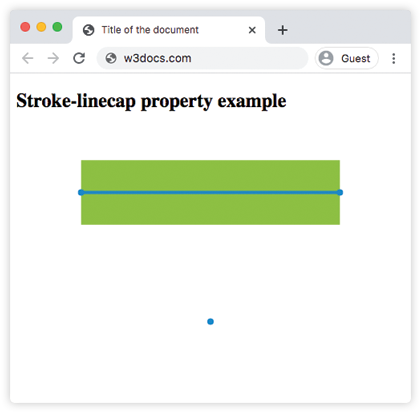
<!DOCTYPE html>
<html>
  <head>
    <title>Title of the document</title>
  </head>
  <body>
    <h2>Stroke-linecap property example</h2>
    <svg viewBox="0 0 6 4">
      <!-- Effect of the "butt" value -->
      <path d="M1,1 h4" stroke="#8ebf42"
        stroke-linecap="butt" />
      <!-- Effect of the "butt" value on a zero length path -->
      <path d="M3,3 h0" stroke="#8ebf42"
        stroke-linecap="butt" />
      <!--
        the following pink lines highlight the
        position of the path for each stroke
        -->
      <path d="M1,1 h4" stroke="#1c87c9" stroke-width="0.05" />
      <circle cx="1" cy="1" r="0.05" fill="#1c87c9" />
      <circle cx="5" cy="1" r="0.05" fill="#1c87c9" />
      <circle cx="3" cy="3" r="0.05" fill="#1c87c9" />
    </svg>
  </body>
</html>Результат
Пример свойства stroke-linecap со значением "round":
Пример CSS stroke-linecap round
html
<!DOCTYPE html>
<html>
  <head>
    <title>Title of the document</title>
  </head>
  <body>
    <h2>Stroke-linecap property example</h2>
    <svg viewBox="0 0 6 4">
      <!-- Effect of the "round" value -->
      <path d="M1,1 h4" stroke="#8ebf42" stroke-linecap="round" />
      <!-- Effect of the "round" value on a zero length path -->
      <path d="M3,3 h0" stroke="#8ebf42" stroke-linecap="round" />
      <!--
      the following pink lines highlight the
      position of the path for each stroke
      -->
      <path d="M1,1 h4" stroke="#1c87c9" stroke-width="0.05" />
      <circle cx="1" cy="1" r="0.05" fill="#1c87c9" />
      <circle cx="5" cy="1" r="0.05" fill="#1c87c9" />
      <circle cx="3" cy="3" r="0.05" fill="#1c87c9" />
    </svg>
  </body>
</html>Пример свойства stroke-linecap со значением "square":
Пример CSS stroke-linecap square
html
<!DOCTYPE html>
<html>
  <head>
    <title>Title of the document</title>
  </head>
  <body>
    <h2>Stroke-linecap property example</h2>
    <svg viewBox="0 0 6 4">
      <!-- Effect of the "square" value -->
      <path d="M1,1 h4" stroke="#8ebf42" stroke-linecap="square" />
      <!-- Effect of the "square" value on a zero length path -->
      <path d="M3,3 h0" stroke="#8ebf42" stroke-linecap="square" />
      <!--
        the following pink lines highlight the
        position of the path for each stroke
        -->
      <path d="M1,1 h4" stroke="#1c87c9" stroke-width="0.05" />
      <circle cx="1" cy="1" r="0.05" fill="#1c87c9" />
      <circle cx="5" cy="1" r="0.05" fill="#1c87c9" />
      <circle cx="3" cy="3" r="0.05" fill="#1c87c9" />
    </svg>
  </body>
</html>Значения
| Значение | Описание |
|---|---|
| butt | Завершает обводку под острым углом. На подпути нулевой длины путь не будет отображаться. Это значение по умолчанию. |
| square | Расширяет обводку за пределы длины пути. |
| round | Делает начальные и конечные точки закруглёнными. |
| initial | Стандартное ключевое слово CSS, которое сбрасывает свойство к его значению по умолчанию. |
| inherit | Стандартное ключевое слово CSS, которое наследует свойство от родительского элемента. |
Практика
На что влияет свойство 'stroke-linecap' в CSS?