Свойство CSS grid-template-rows
Свойство grid-template-rows определяет размер строк в сеточной раскладке. Количество строк определяется числом предоставленных значений, хотя его также можно контролировать с помощью repeat() с auto-fill или auto-fit. Значения разделяются пробелами, и каждое значение задаёт размер дорожки строки.
INFO
Помимо основных значений, есть дополнительные значения, такие как fit-content и repeat(), которые помогают создавать гибкие и компактные сеточные раскладки.
| Initial Value | none |
|---|---|
| Applies to | Grid containers. |
| Inherited | No. |
| Animatable | Yes. The size of the rows is animatable. |
| Version | CSS Grid Layout Module Level 1 |
| DOM Syntax | object.style.gridTemplateRows = "20px 100px"; |
Syntax
CSS grid-template-rows syntax
css
grid-template-rows: none | auto | max-content | min-content | <flex> | fit-content | repeat(...) | <length> | <percentage> | minmax() | subgrid | auto-fill | auto-fit;Note: initial and inherit are standard CSS keywords for resetting or inheriting values, but are rarely needed in modern grid layouts.
Example of the grid-template-rows property:
CSS grid-template-rows code example
html
<!DOCTYPE html>
<html>
<head>
<title>Title of the document</title>
<style>
.auto-container {
display: grid;
grid-template-columns: auto auto auto auto;
grid-template-rows: auto auto;
gap: 10px;
background-color: #ccc;
padding: 10px;
margin-top: 30px;
}
.auto-container > div {
background-color: #eee;
text-align: center;
padding: 30px 0;
font-size: 30px;
}
</style>
</head>
<body>
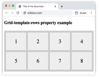
<h2>Grid-template-rows property example</h2>
<div class="auto-container">
<div>1</div>
<div>2</div>
<div>3</div>
<div>4</div>
<div>5</div>
<div>6</div>
<div>7</div>
<div>8</div>
</div>
</body>
</html>Result
Example of the grid-template-rows property with the specified size of rows:
CSS grid-template-rows another code example
html
<!DOCTYPE html>
<html>
  <head>
    <title>Title of the document</title>
    <style>
      .grid-container {
        display: grid;
        grid-template-columns: auto auto auto auto;
        grid-template-rows: 100px 300px;
        gap: 10px;
        background-color: #ccc;
        padding: 10px;
      }
      .grid-container > div {
        background-color: #eee;
        text-align: center;
        padding: 20px 0;
        font-size: 30px;
      }
    </style>
  </head>
  <body>
    <h2>Grid-template-rows property example</h2>
    <div class="grid-container">
      <div>1</div>
      <div>2</div>
      <div>3</div>
      <div>4</div>
      <div>5</div>
      <div>6</div>
      <div>7</div>
      <div>8</div>
    </div>
  </body>
</html>Values
| Value | Description |
|---|---|
| none | This is the default value of the property. |
| auto | The size of the row is determined by its content or available space. |
| max-content | The size of each row is determined by the largest intrinsic size of its items. |
| min-content | The size of each row is determined by the smallest intrinsic size of its items. |
| minmax(min, max) | Defines a track size as a size range greater than or equal to min and less than or equal to max. Functions as a track sizing function. |
<length> | The size of the rows is specified by length value. |
<percentage> | The size of the rows is specified by percentages. |
<flex> | A non-negative dimension with the unit fr (fraction of available space) that specifies the track’s flex factor. Each <flex>-sized track shares remaining space in proportion to its flex factor. |
| fit-content | Represents min(max-content, max(auto, argument)). Similar to auto (minmax(auto, max-content)), but ensures the track size is at least the provided argument. |
| repeat(...) | Represents a repeated fragment of the track list, allowing a large number of rows that exhibit a recurring pattern to be written in a more compact form. This value is widely supported in modern browsers. |
| subgrid | Indicates the grid will adopt the spanned portion of its parent grid in the specified axis. The sizes of the grid rows/columns are taken from the parent grid’s definition. |
| auto-fill | Places as many fit-able rows into the grid as possible without overflowing the container. |
| auto-fit | Similar to auto-fill, but collapses empty tracks to zero size. |
| initial | Makes the property use its default value. |
| inherit | Inherits the property from its parent element. |
Practice
Что делает свойство grid-template-rows в CSS?