CSS свойство grid
Свойство grid CSS является сокращённым свойством для следующих свойств:
- grid-template-rows
- grid-template-columns
- grid-template-areas
- grid-auto-rows
- grid-auto-columns
- grid-auto-flow
В одном объявлении grid можно указать либо явные свойства сетки (grid-template-rows, grid-template-columns, grid-template-areas), либо неявные свойства сетки (grid-auto-rows, grid-auto-columns, grid-auto-flow). Сокращённое свойство напрямую отображает эти подсвойства, а любые опущенные подсвойства сбрасываются до их начальных значений.
| Начальное значение | none |
|---|---|
| Применяется к | Контейнеры сетки. |
| Наследуется | Нет. |
| Анимация | Да. Сетка (Grid layout) анимируется. |
| Версия | CSS Grid Layout Module Level 1 |
| Синтаксис DOM | Object.style.grid = "150px / auto auto auto"; |
Синтаксис
Синтаксис свойства CSS grid
css
grid: none | <grid-template-rows> / <grid-template-columns> | <grid-template-areas> | <grid-template-rows> / [ auto-flow && dense? ] <grid-auto-columns>? | [ auto-flow && dense? ] <grid-auto-rows>? / <grid-template-columns> | initial | inherit;Пример 1: Базовое сокращение grid
html
<!DOCTYPE html>
<html>
  <head>
    <title>Title of the document</title>
    <style>
      .grid-container {
        display: grid;
        grid: 100px / auto auto auto;
        background-color: #ccc;
        padding: 10px;
      }
      .grid-box {
        background-color: #eee;
        border: 1px solid rgba(0, 0, 0, 0.8);
        padding: 30px;
        font-size: 30px;
        text-align: center;
      }
    </style>
  </head>
  <body>
    <h2>Grid property example</h2>
    <div class="grid-container">
      <div class="grid-box">1</div>
      <div class="grid-box">2</div>
      <div class="grid-box">3</div>
      <div class="grid-box">4</div>
      <div class="grid-box">5</div>
      <div class="grid-box">6</div>
      <div class="grid-box">7</div>
      <div class="grid-box">8</div>
      <div class="grid-box">9</div>
    </div>
  </body>
</html>Пример 2: Сокращение grid с auto-flow
html
<!DOCTYPE html>
<html>
<head>
<title>Title of the document</title>
<style>
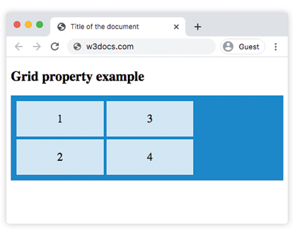
.grid-container {
display: grid;
grid: auto auto / auto-flow column auto auto auto;
gap: 5px;
background-color: #1c87c9;
padding: 10px;
}
.grid-container > div {
background-color: rgba(255, 255, 255, 0.8);
text-align: center;
padding: 20px 0;
font-size: 20px;
}
</style>
</head>
<body>
<h2>Grid property example</h2>
<div class="grid-container">
<div class="grid-box1">1</div>
<div class="grid-box2">2</div>
<div class="grid-box3">3</div>
<div class="grid-box4">4</div>
</div>
</body>
</html>Результат
Пример 3: Сокращение grid с фиксированными размерами строк
html
<!DOCTYPE html>
<html>
  <head>
    <title>Title of the document</title>
    <style>
      .grid-box1 {
        grid-area: 1 / 1 / 2 / 2;
      }
      .grid-box2 {
        grid-area: 1 / 2 / 2 / 3;
      }
      .grid-box3 {
        grid-area: 1 / 3 / 2 / 4;
      }
      .grid-box4 {
        grid-area: 2 / 1 / 3 / 2;
      }
      .grid-box5 {
        grid-area: 2 / 2 / 3 / 3;
      }
      .grid-box6 {
        grid-area: 2 / 3 / 3 / 4;
      }
      .grid-container {
        display: grid;
        grid: 100px / auto auto auto;
        gap: 10px;
        background-color: #1c87c9;
        padding: 10px;
      }
      .grid-container > div {
        background-color: #eee;
        text-align: center;
        padding: 20px 0;
        font-size: 25px;
      }
    </style>
  </head>
  <body>
    <h2>Grid property example</h2>
    <div class="grid-container">
      <div class="grid-box1">1</div>
      <div class="grid-box2">2</div>
      <div class="grid-box3">3</div>
      <div class="grid-box4">4</div>
      <div class="grid-box5">5</div>
      <div class="grid-box6">6</div>
    </div>
  </body>
</html>Значения
| Значение | Описание | Запустить |
|---|---|---|
none | Размеры столбцов и строк не указаны. Это значение по умолчанию. | |
grid-template-rows / grid-template-columns | Указывает размеры строк и столбцов. | Запустить » |
grid-template-areas | Указывает макет сетки с использованием именованных областей сетки. | Запустить » |
grid-template-rows / [auto-flow && dense?] grid-auto-columns | Устанавливает размеры строк и указывает автопоток и плотное размещение для столбцов. | |
[auto-flow && dense?] grid-auto-rows / grid-template-columns | Устанавливает размеры столбцов и указывает автопоток и плотное размещение для строк. | |
initial | Сбрасывает свойство до значения по умолчанию. | |
inherit | Наследует свойство от родительского элемента. |
Практика
Что можно сделать с помощью CSS Grid Layout согласно содержанию на странице?